Visual Hierarchy: Why Some Dubai Websites Feel Expensive
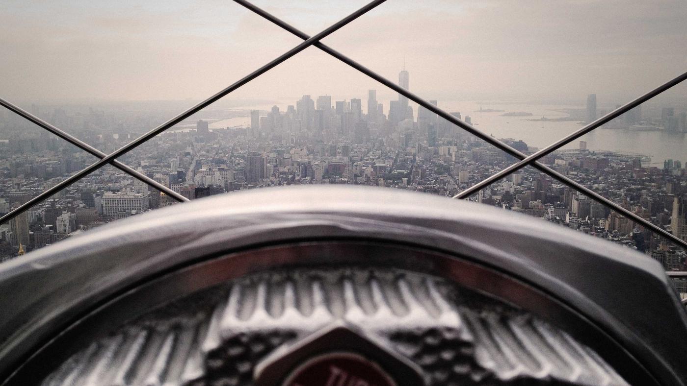
The Dubai sites that feel expensive are rarely the ones with the most gold. They are the ones that decide what you should look at first: a headline you can repeat, a photo that belongs to the business, one button, and enough quiet around those things that your eye is not arguing. Visual hierarchy is that decision, made visible. More ornament is usually a sign nobody made it.
Clients ask for “luxury web design” when they mean “please do not look like a free theme.” Fair. The lever is not a marble overlay. It is type, contrast, and restraint. I wrote the first-screen checklist in the five-second homepage. This piece is the craft underneath: why two sites with the same content can feel like a villa and a flyer. The luxury-specific mistakes sit in luxury web design in Dubai. Here we stay on hierarchy, because it is what I change even when the budget is ordinary.
Type scale is the cheapest luxury
One size of text, bolded at random, is how a site feels like a Word document. A scale is a small set of sizes with jobs: a display heading, a section heading, a body, a caption. The visitor should feel the difference without reading a style guide. On a phone, the H1 has to wrap without turning into a poster. If your slogan needs 11 words at 48px, it is not a heading. It is a paragraph wearing a costume.
Line length matters. Full-bleed sentences across a desktop are tiring. I cap measure so the eye can finish a line. Line height is a bit generous. That empty-looking space is the product. It is also where Arabic and English have to both work; a scale that only looks good in English will break when the heading is longer in Arabic. Test both, or you only designed half the hierarchy.
Contrast is respect, not a mood
Light grey text on white marble is not refined. It is a tax on anyone reading in sun, in a car, or on a mid-range screen. I keep body text dark enough to read. Links look like links. Buttons look like buttons. If the brand colour fails contrast, we use it on large shapes, not on 14px captions. Accessibility here is not a separate moral lecture. It is why the site feels calm. You are not squinting, so you assume the company is in control.
Contrast also means visual weight. A full-bleed video behind white type, plus a glass card, plus a rotating banner, plus a chat bubble, is all “important.” So nothing is. Hierarchy is subtraction. I turn things off until the remaining thing can be named: this is the offer, this is the proof, this is the tap.
One primary button
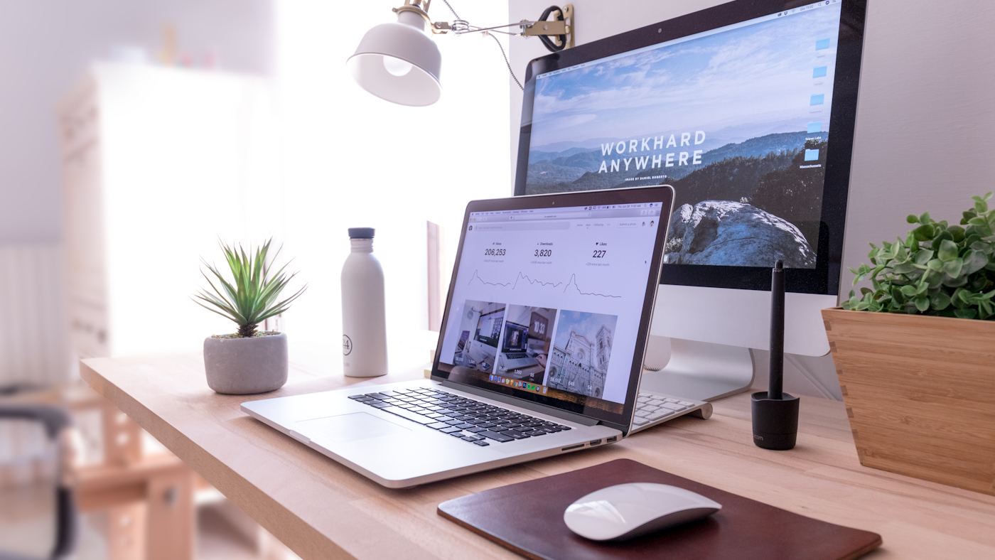
WhatsApp, Call, Book, Download brochure, Shop, Learn more, Watch video, Sign in — I have counted eight competing controls above the fold. That is a menu, not a decision. Pick one primary per page. Style it once. Secondary actions as text or as a quieter outline. If villa clients WhatsApp and procurement downloads a PDF, those can live on different pages or as a primary plus one quiet secondary. They cannot both be the same gold pill, three times each.
The primary should look the same in the header and in the hero. If the header says “Get a quote” and the hero says “Discover” and the sticky footer says “Chat,” you have three brands. Align the verb with what people already do in the UAE. For most service businesses that is WhatsApp or call. I will still put a form on contact. It should not win a shouting match with the thing people will actually use.
Site looks busy and cheap even after you paid for gold? Hierarchy is the fix, not another overlay.
Send the URL on WhatsAppBreathing room is not wasted space
Crowding is the other way sites look cheap: cards touching, photos with no margin, section after section with no pause. Space is how you signal that you did not have to fill every dirham of pixels with a badge. I am not talking about a single sentence on a huge black screen that takes four scrolls to find Contact. That is theatre. I am talking about consistent padding, a grid that lines up, and photos that are allowed to be large because there are fewer of them.
What I cut first
- Slider dots and fake counters
- Partner logo carousels that never stop
- Decorative lines that do not separate real groups
- A second testimonial block that repeats the first
The page usually feels more expensive after the deletion, before I have touched colour. That is hierarchy doing the branding job people thought gold would do. Related: web design versus branding.
Not more gold
Metallic gradients, foil-effect type, and stock marble are the default “Dubai luxury” kit. Used on everything, they read as a theme. Used once, maybe. The sites I respect in this city — clinics, architects, some retailers — often look quiet: strong type, real materials in the photography, black or a deep colour, one accent. You can see the same bias in how I treat portfolio work. If your trade is actually gold jewellery, of course the metal can show up. If your trade is accounting, gold is a costume.
Hierarchy is also motion. A page that animates every heading on scroll is not premium. It is tired. A short fade, or nothing, lets the type do the work. On a mid-range phone the animations also cost smoothness. Expensive should feel easy, not busy.
If you want a pass on your current homepage, I will screenshot the first screen and mark the order the eye actually moves. We will usually change type, cut a button, and add space before we talk about a new colour. That is the work. WhatsApp me the URL if you want that markup. It is faster than another round of “make it more luxurious.”
Frequently asked questions
Does a Dubai website need gold and marble to look premium?
No. Contrast, type, spacing and one clear action do more than metallic overlays. Gold as a default texture often looks cheaper, not richer.
How many primary buttons should a page have?
One. Secondary actions can exist as text links or quieter buttons. When everything is primary, nothing is.
What should I fix first if the site feels messy?
Type scale and the first screen. If the headline, proof and button cannot be read in a glance, add less decoration, not more.
I’ll set type, space and one button so the site feels expensive without the costume.
WhatsApp +971 52 486 7767